|
|
|
 |
|
|
データ可視化,データマイニングおよび統計のための高速な直感的ツール
DataDesk
|
|
相互リンク・プロット
All Data Desk's plots and tables are linked together so that points selected in one display highlight in all other displays. Select bars in a bar chart or histogram, slices of a pie chart, rows, columns, or cells of a table, or any points in a scatterplot, rotating plot, dotplot, or boxplot, and the selected points highlight in all plots. Such consistency reveals relationships among several variables, identigfy clusters and subgroups and helps you to catch errors and outliers.
Colors and symbols are also linked across plots. Change the color or symbol of a group of points in one plot and the points change in all plots.
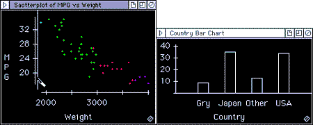
In the example above, points selected in a scatterplot of Miles per Gallon vs. Weight are highlighted in the bar chart of Country. Selecting the points in the high end of the weight scale shows which country makes the heaviest cars. Selecting the US bar in the bar chart shows how the cars built in the US compare to those built in other countries.
|
| DataDeskのTopページに戻る |
|
|